Website Accessibility Checklist: 8 Key Steps for 2025

Why a More Accessible Web Starts With You
Building a website is only half the battle. Creating an inclusive online experience that everyone can access, regardless of ability, is a fundamental requirement of modern development. The benefits are clear, from expanding your audience and improving brand reputation to enhancing SEO and ensuring legal compliance with standards like the Americans with Disabilities Act (ADA). However, translating the extensive Web Content Accessibility Guidelines (WCAG) into practice can feel like a monumental task. This is where a focused, actionable website accessibility checklist becomes an indispensable tool for any developer.
This guide eliminates the guesswork. We will move beyond abstract principles and provide a detailed, step-by-step checklist covering the most critical aspects of digital accessibility. Forget vague advice; this is a hands-on resource filled with code snippets, practical implementation details, and real-world scenarios to guide your development process. You will learn precisely how to implement robust solutions for common accessibility hurdles.
This comprehensive listicle is designed for professional developers, technical leads, and even low-code enthusiasts who are committed to building better, more inclusive web products. We will explore eight essential checkpoints, including:
- Proper Alt Text for Images
- Full Keyboard Navigation Support
- Sufficient Color Contrast Ratios
- Correct Semantic HTML Structure
- Clear Form Labels and Instructions
- Comprehensive Screen Reader Compatibility
- Responsive Design for Mobile and Assistive Tech
- Visible Focus Management and Indicators
By the end of this article, you will have a clear framework to audit your own sites and integrate accessibility best practices directly into your workflow, making the web a more welcoming place for everyone.
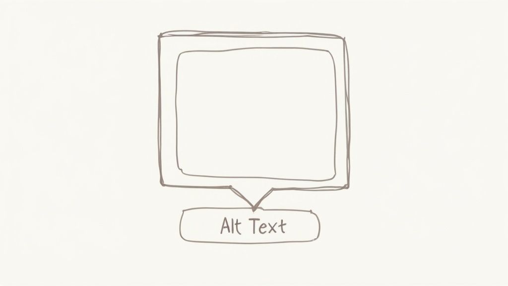
1. Alt Text for Images
Alternative text, or alt text, is a fundamental pillar of any robust website accessibility checklist. It is a concise, written description of an image that is embedded within the HTML <img> tag. This text is read aloud by screen readers, allowing users with visual impairments to understand the content and function of images on a webpage. It also appears in place of an image if the file fails to load and provides context to search engine crawlers, improving SEO.
Effective alt text is not just about describing what an image shows; it’s about conveying its purpose within the page's context. For instance, on an e-commerce site like Target, the alt text for a product image should describe key visual features that a sighted user would see, such as "red KitchenAid stand mixer with a silver bowl." This ensures equitable access to vital information for all users.
How to Implement Effective Alt Text
Writing meaningful alt text requires careful consideration of the image's role on the page. Here are specific, actionable steps for implementation:
- Be Descriptive and Concise: Aim for under 125 characters. This is not a strict rule but a guideline to accommodate common screen reader behavior. The description should be long enough to convey the necessary information but short enough to be easily digestible.
- Avoid Redundancy: Screen readers announce an element as an "image," so starting your alt text with "Image of..." or "Picture of..." is unnecessary. Jump straight into the description. For example, instead of "Image of a golden retriever playing fetch," simply use "A golden retriever catches a red frisbee in a grassy park."
- Use the
alt=""Attribute for Decorative Images: If an image is purely for decoration, like a stylistic border or an abstract background pattern, it should have an empty alt attribute (alt=""). This signals to screen readers that the image is not essential and can be skipped, preventing auditory clutter for the user. - Context is Key: The same image might require different alt text depending on its context. A photo of the Eiffel Tower on a travel blog might have the alt text, "The Eiffel Tower lit up against a twilight sky." On a historical site, it might be, "The Eiffel Tower during its construction in 1888." Always consider what information the image is meant to communicate to your audience.
2. Keyboard Navigation Support
Keyboard navigation support is a critical component of any comprehensive website accessibility checklist. It ensures that all interactive elements, links, and content on a website can be fully accessed and operated using only a keyboard. This functionality is essential for users with motor disabilities who cannot use a mouse, individuals with visual impairments who rely on screen readers in conjunction with a keyboard, and power users who prefer keyboard shortcuts for efficiency.
Proper implementation allows users to move through a page in a logical sequence, typically using the Tab and Shift+Tab keys, and to activate elements using Enter or the Spacebar. For example, robust platforms like GitHub and Google’s search interface are fully navigable via keyboard, with clear focus indicators guiding the user. This ensures that no user is locked out of core functionality simply because they cannot use a pointer device.
How to Implement Effective Keyboard Navigation
Achieving full keyboard accessibility requires a thoughtful approach to structure, styling, and functionality. Here are specific, actionable steps for implementation:
- Ensure a Logical Tab Order: The order in which interactive elements receive focus (the tab order) must follow a logical and intuitive sequence that aligns with the visual layout of the page. This is usually achieved by using semantic HTML elements in the correct order. Avoid using
tabindexwith a positive value, as it disrupts the natural document flow. - Maintain a Visible Focus Indicator: When an element is selected via the keyboard, it must have a clear visual indicator, such as a distinct outline. This "focus ring" should have a high contrast against the background to be easily seen. Never disable outlines (e.g.,
outline: none;) without providing a more robust, visible alternative. - Implement "Skip to Content" Links: For pages with extensive navigation menus, a "skip link" is crucial. This is an anchor link, often the first focusable item on the page, that allows keyboard users to bypass the header and navigation and jump directly to the main content, saving time and effort.
- Test All Interactive Components: Manually navigate your entire site using only the keyboard. Can you access every link, button, and form field? Can you operate complex widgets like sliders, custom dropdowns, and modal windows? All functionality available to a mouse user must also be available to a keyboard user.
The following infographic illustrates the basic user flow for keyboard navigation, showing how a user moves focus, sees the indicator, and uses a skip link.
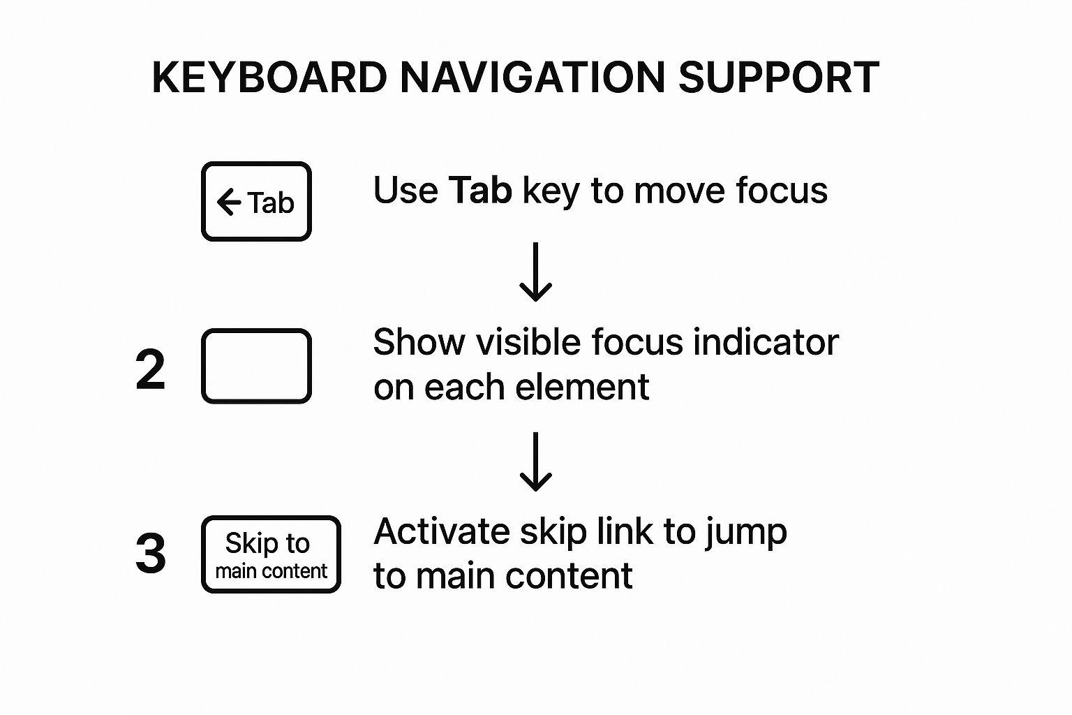
This process flow highlights the fundamental cycle of tabbing to an element, receiving clear visual feedback, and having the option to bypass repetitive navigation sections.
3. Color Contrast Requirements
Color contrast is a critical component of any comprehensive website accessibility checklist, referring to the difference in luminance, or brightness, between the foreground color of text and the background color it sits on. Ensuring adequate contrast is vital for readability, especially for users with visual impairments such as low vision and color blindness. It also significantly benefits users viewing a screen in bright sunlight or other challenging lighting conditions, making your content more legible for everyone.

Adhering to color contrast standards ensures that the information on your site is perceivable to the widest possible audience. For instance, government websites like GOV.UK are prime examples of high-contrast design in action, using a simple palette of black, white, and blue to maximize readability. Similarly, platforms like Medium prioritize a high-contrast reading experience, ensuring text is clear and easy to follow. This commitment to contrast is a hallmark of inclusive design.
How to Implement Effective Color Contrast
Meeting contrast requirements involves more than just picking light and dark colors; it requires precise measurement and thoughtful application across your entire user interface. Here are specific, actionable steps for implementation:
- Meet WCAG Ratios: The Web Content Accessibility Guidelines (WCAG) set clear targets. Aim for a contrast ratio of at least 4.5:1 for normal-sized text. For large text (18pt/24px or 14pt/19px bold), the minimum ratio is 3:1.
- Use Contrast Checking Tools: Manually guessing contrast ratios is unreliable. Use tools like the WebAIM Color Contrast Checker or browser developer tools to get precise measurements for your chosen color pairings. These tools make it easy to verify compliance.
- Don't Rely on Color Alone: Never use color as the sole means of conveying information, indicating an action, or distinguishing a visual element. For example, supplement a red error message with an icon and explicit text to ensure users with color blindness can understand it.
- Account for Interactive States: Remember to check the contrast ratios for all interactive element states, including links, buttons, and form fields. Ensure that hover, focus, and active states also meet the minimum contrast requirements, as these are crucial for usability.
4. Semantic HTML Structure
Semantic HTML is a cornerstone of any comprehensive website accessibility checklist, focusing on using HTML elements according to their meaning, not just their appearance. It involves choosing the correct element for the content it holds, which creates a logical, machine-readable document outline. This structure is essential for assistive technologies like screen readers, which rely on semantic markup to interpret and convey the hierarchy and purpose of content to users with disabilities.
Using semantic tags like <nav>, <main>, and <article> provides a clear roadmap of the page layout. This allows users to navigate directly to key sections, such as jumping from the header to the main content, without having to tab through every single interactive element. For example, sites like MDN Web Docs and A List Apart masterfully use semantic elements to structure their technical articles, making complex information far more navigable and understandable for everyone.
How to Implement Semantic HTML
Building a semantically correct structure requires a thoughtful approach to content organization from the ground up. Here are specific, actionable steps for implementation:
- Use Heading Tags Logically: Structure your content with heading tags (
<h1>through<h6>) in a sequential, logical order. A page should have only one<h1>, and you should never skip heading levels (e.g., jumping from an<h2>to an<h4>). This creates a clear and navigable outline of your page content for assistive technologies. - Implement Landmark Roles: Use HTML5 landmark elements to define the major regions of your page. Use
<nav>for primary navigation blocks,<main>for the central content,<aside>for complementary information (like sidebars), and<footer>for site-wide information. These act as signposts for screen reader users. - Choose the Right Element for the Job: Use elements for their intended purpose. Use
<button>for actions that trigger a script on the current page and<a>for navigation to a new page or resource. Use<ul>for unordered lists and<ol>for ordered, sequential lists. Misusing these elements can create confusion and barriers. Learn more about how this fits into overall web development best practices on webarc.day. - Leverage Semantic HTML5 Elements: Beyond landmarks, use elements like
<article>,<section>,<header>, and<figure>to add more granular meaning to your content. An<article>can represent a self-contained piece of content like a blog post, while a<section>can group related content within it. This adds layers of context that improve the user experience for everyone.
5. Form Labels and Instructions
Properly labeled forms are a critical component of any comprehensive website accessibility checklist. This practice involves ensuring every form field, such as a text input or checkbox, has a clear, descriptive label that is programmatically associated with it. This connection allows assistive technologies, like screen readers, to announce the purpose of each field, enabling users with disabilities to understand what information is required and to navigate and complete forms efficiently. Without this link, a form can be an insurmountable barrier.
Well-structured forms benefit all users by improving clarity and reducing cognitive load. For instance, payment forms on sites like Stripe use explicit, programmatically linked labels for fields like "Card number" and "CVC," which are essential for successful transactions. This ensures a seamless experience for users relying on screen readers, voice commands, or keyboard navigation, while also making the process more straightforward for everyone.
How to Implement Effective Form Labels
Creating accessible forms requires a deliberate approach to labeling and structure. Here are specific, actionable steps for implementation:
- Use the
<label>Element Correctly: The most robust method is to use the<label>element with aforattribute that matches theidof the corresponding input field. For example:<label for="email">Email Address</label><input type="email" id="email">. This creates a direct, clickable association that is universally understood by assistive technologies. - Mark Required Fields Clearly: Indicate required fields visually with an asterisk (
*) and programmatically with therequiredoraria-required="true"attribute on the input element. Crucially, explain what the asterisk means at the beginning of the form (e.g., "* Indicates a required field"). This provides multiple cues for all users. - Group Related Fields with
<fieldset>and<legend>: When you have a group of related inputs, such as a set of radio buttons for a shipping address type, wrap them in a<fieldset>element. Use a<legend>element as the first child of the<fieldset>to provide a clear group label, like "Choose a shipping method." This helps screen reader users understand the context of the choices. - Provide Clear Instructions and Error Messages: Place instructions before the form fields to which they apply. When a user makes an error, the message should be clear, specific, and programmatically linked to the relevant input using
aria-describedby. Instead of a generic "Invalid input," use a precise message like, "Please enter a valid email address."
6. Screen Reader Compatibility
Screen reader compatibility is a critical component of any comprehensive website accessibility checklist. It ensures that your website can be effectively navigated and understood by users with visual impairments who rely on assistive technologies. These tools convert digital text and interface elements into synthesized speech or braille, allowing non-sighted users to access web content. True compatibility goes beyond basic text-to-speech; it requires proper semantic HTML structure, ARIA roles, and a logical content flow.
Without this focus, a website can become an unnavigable maze for screen reader users. For instance, a well-structured site like the BBC News website uses clear headings and ARIA landmarks, enabling users to quickly jump to the main story or navigation sections. This functionality is not a luxury but a requirement for providing an equitable digital experience.
How to Implement Effective Screen Reader Compatibility
Achieving robust screen reader compatibility involves both clean code and thoughtful design. Here are specific, actionable steps to ensure your site works seamlessly with tools like NVDA, JAWS, and VoiceOver:
- Structure Content with Semantic HTML: Use HTML elements for their intended purpose. Use
<nav>for navigation,<main>for primary content, and<aside>for supplementary information. Most importantly, use heading tags (<h1>through<h6>) in a logical, hierarchical order to create a navigable outline of the page. This is the primary way screen reader users skim content. - Leverage ARIA for Dynamic Components: Use Accessible Rich Internet Applications (ARIA) attributes to add context to complex interactive elements like custom dropdowns, sliders, or tab panels. For example, use
aria-expanded="true"or"false"on a button that controls a collapsible section. This tells the screen reader the state of the element, which is otherwise invisible. - Announce Dynamic Content Updates: When content on a page changes without a full reload (like a product being added to a cart or a search result filtering), these changes must be announced. Use ARIA live regions (
aria-live="polite") to make screen readers aware of these updates, preventing user confusion. - Test with Actual Screen Readers: There is no substitute for real-world testing. Download and use a screen reader like the free and open-source NVDA (NonVisual Desktop Access) to navigate your site. Try completing key tasks with your monitor turned off to simulate the user experience and identify pain points you might otherwise miss. You can discover more about these crucial checks with in-depth website testing techniques on webarc.day.
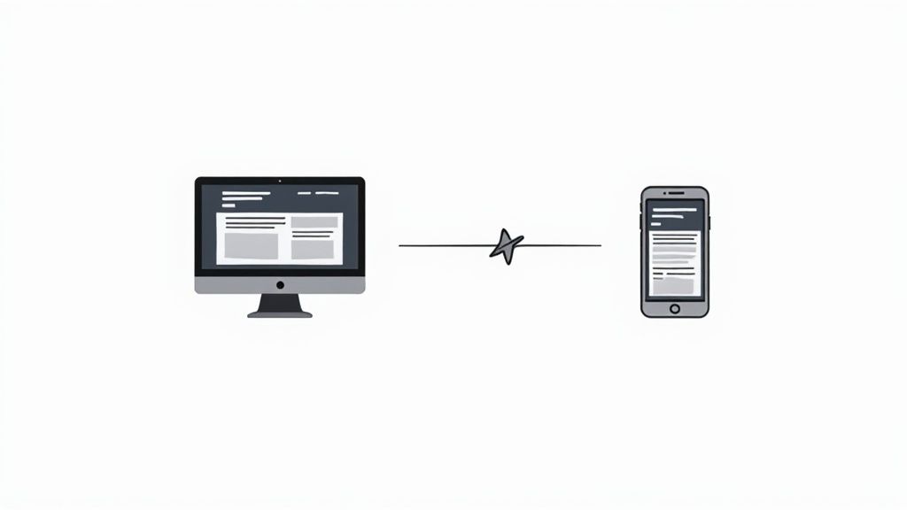
7. Responsive Design for Mobile Accessibility
Responsive design for mobile accessibility is a critical component of a modern website accessibility checklist. It involves creating a web experience that is fully functional and easy to navigate for people with disabilities using mobile devices like smartphones and tablets. This goes beyond simply making a site look good on a small screen; it ensures that features like touch targets, zoom capabilities, and orientation changes work seamlessly with assistive technologies such as mobile screen readers (VoiceOver, TalkBack) and voice control systems.
With mobile devices accounting for the majority of web traffic, a non-responsive or inaccessible mobile site effectively excludes a huge portion of users. For example, Google’s mobile search results and Facebook's mobile website are built with accessibility at their core, allowing screen reader users to navigate content logically and activate links easily. This commitment ensures that vital information and social connections are available to everyone, regardless of the device they use or the abilities they possess.
How to Implement Responsive Design for Mobile Accessibility
Ensuring your website is accessible on mobile devices requires a focused approach on interaction design and technical implementation. Here are specific, actionable steps to follow:
- Ensure Adequate Touch Target Size: Interactive elements like buttons and links must be large enough to be activated easily without accidentally tapping a neighboring element. Aim for a minimum touch target size of 44x44 CSS pixels, with sufficient spacing between targets. This accommodates users with motor impairments.
- Support Zoom and Reflow: Users with low vision rely on screen magnification. Your site must allow zooming up to at least 200% without requiring horizontal scrolling to read content (WCAG's "reflow" criterion). This can be achieved by using a proper viewport meta tag and relative units like
remandemfor text and layout containers instead of fixed pixels. - Accommodate Screen Orientation: Your website's content and functionality must be available in both portrait and landscape orientations. Do not lock the orientation, as some users may have their devices mounted in a fixed position, for instance, on a wheelchair.
- Test with Mobile Assistive Technologies: Manually test your site using mobile screen readers like VoiceOver on iOS and TalkBack on Android. Verify that all interactive elements are focusable, correctly labeled, and that the reading order makes sense. Also, test with voice control to ensure interactive elements can be activated by their visible labels. For more in-depth guidance, you can explore various web development tutorials on webarc.day that cover these topics.
8. Focus Management and Visual Indicators
Effective focus management is a critical component of any comprehensive website accessibility checklist, ensuring that users who rely on keyboards or other assistive technologies can navigate a site logically and confidently. It involves programmatically controlling which element on the page has focus and, just as importantly, making that focus visually apparent. A clear visual indicator, often a border or outline, shows users exactly where they are on a page, allowing them to understand their current position and what actions are available.
Without proper focus management, a keyboard user can become lost, unable to interact with modals, forms, or dynamic content. For example, when a modal window opens, focus should move directly into that modal. Similarly, when it closes, focus should return to the element that triggered it. Websites like GOV.UK excel at this, using a high-contrast yellow and black focus indicator that is impossible to miss, ensuring users always know where they are.
How to Implement Effective Focus Management
Successfully managing focus goes beyond just allowing the browser's default behavior. It requires a thoughtful approach to user interaction design and development. Here are specific, actionable steps for implementation:
- Never Remove Focus Outlines: The most common mistake is using CSS like
outline: none;to remove the default focus ring for aesthetic reasons. Never do this without providing a highly visible, custom alternative. A good focus indicator is essential for keyboard navigation. - Ensure High Contrast: Your visual focus indicator must have a minimum contrast ratio of 3:1 against the adjacent background color. This ensures it is perceptible to users with low vision. Use tools to check your color combinations to meet WCAG 2.1 Success Criterion 1.4.11 Non-Text Contrast.
- Manage Focus for Dynamic Content: When new content appears, such as a modal dialog, an expandable section, or a notification, you must programmatically move the user's focus. For modals, trap the focus within the dialog so the user cannot accidentally tab to elements in the background. When the modal closes, return focus to the original triggering element.
- Test the Focus Order: The order in which interactive elements receive focus when a user presses the
Tabkey must be logical and intuitive. It should follow the visual reading order of the page, typically from left to right and top to bottom. A disorganized focus order can make a website completely unusable for keyboard-only users.
Website Accessibility Features Comparison
| Accessibility Feature | Implementation Complexity 🔄 | Resource Requirements ⚡ | Expected Outcomes 📊 | Ideal Use Cases 💡 | Key Advantages ⭐ |
|---|---|---|---|---|---|
| Alt Text for Images | Low – straightforward to add | Low – mainly content writing | Improved accessibility and SEO | Image-heavy sites needing descriptive text | Essential for screen readers, SEO boost |
| Keyboard Navigation Support | Medium – complex for custom UI | Medium – development & maintenance | Full keyboard operability, better usability | Interactive apps, dynamic interfaces | Crucial for motor-impaired users, power users |
| Color Contrast Requirements | Low to Medium – design adjustments | Low – design & testing tools | Enhanced readability and compliance | Text-heavy or brand-sensitive sites | Improves readability, essential for visual impairments |
| Semantic HTML Structure | Medium – may need refactoring | Medium – developer education | Logical structure aiding navigation/SEO | Content-rich websites | Better screen reader navigation, SEO benefits |
| Form Labels and Instructions | Low to Medium – requires consistency | Low – markup and validation | Higher form completion, reduced errors | All forms and input-heavy interfaces | Essential for screen readers, reduces user errors |
| Screen Reader Compatibility | High – specialized testing | High – ARIA, markup, testing | Effective assistive tech support | Sites targeting visually impaired users | Provides independence, legal compliance |
| Responsive Design for Mobile | Medium to High – responsive setup | Medium – design and device testing | Accessible and usable on mobile devices | Mobile-first websites, apps | Enhances mobile usability and access |
| Focus Management and Visual Indicators | Medium – requires careful logic | Medium – development and testing | Clear focus visibility, improved navigation | Keyboard-dependent navigation contexts | Essential for keyboard users, enhances UX |
Making Accessibility an Ongoing Practice
Navigating the world of digital inclusivity can seem like a monumental task, but this website accessibility checklist provides a powerful, actionable foundation. We have broken down the core pillars of a truly accessible website, moving from foundational elements to interactive user experiences. By now, you should have a clear understanding of how to implement these critical checks and why they matter so profoundly.
Let’s quickly recap the essential takeaways. We started with alt text for images and the non-negotiable requirement for keyboard-only navigation. We then delved into the specifics of color contrast and the foundational importance of a logical document flow using semantic HTML. From there, we covered the practicalities of user input with clear form labels and ensured compatibility with assistive technologies through robust screen reader testing. Finally, we addressed the modern web by emphasizing responsive design and the user-oriented necessity of clear focus indicators. Each of these items represents a crucial checkpoint in your development workflow.
Completing this checklist is a significant achievement, but it's important to view it not as a finish line, but as a starting point. The digital landscape is in constant flux, and the work of creating an accessible web is never truly "done." True accessibility is a mindset, an ongoing commitment that must be woven into the fabric of your development process from the initial wireframe to the final deployment and beyond.
From Checklist to Culture
The most effective way to ensure long-term accessibility is to shift from a reactive, audit-based approach to a proactive, integrated one. This means making accessibility a core tenet of your team's culture. Here are some actionable steps to make that happen:
- Integrate Early and Often: Don't wait until the end of a project to run an accessibility scan. Discuss accessibility during design reviews. Code with semantic HTML from the very first line. Test with a keyboard and screen reader as you build new components. This "shift-left" approach catches issues early, when they are far easier and cheaper to fix.
- Combine Automated and Manual Testing: Automated tools like Lighthouse, Axe, or WAVE are fantastic for catching low-hanging fruit, such as missing alt text or color contrast violations. However, they can't assess the quality of the user experience. You must supplement these scans with manual testing. Can you logically navigate the entire site using only the Tab key? Does the screen reader announce dynamic content changes in an understandable way? This human-centric testing is irreplaceable.
- Embrace Continuous Learning: The Web Content Accessibility Guidelines (WCAG) evolve, new assistive technologies emerge, and our understanding of user needs deepens over time. Fostering a culture of continuous learning is vital. Encourage your team to stay updated on best practices, share new techniques, and regularly revisit their understanding of core accessibility principles.
The Broader Impact: Why This Work Matters
Mastering the items on this website accessibility checklist does more than just help you comply with legal standards or avoid potential lawsuits. It makes you a better developer. Writing accessible code forces you to be more deliberate, logical, and structured in your approach. It often leads to cleaner, more maintainable codebases, improved SEO, and a more robust product that performs better across all devices and platforms.
Most importantly, this commitment has a profound human impact. By building accessible digital products, you are actively creating a more equitable and inclusive internet. You are ensuring that people with disabilities can independently access information, participate in commerce, and engage with online communities, rights that many of us take for granted. Every form that's properly labeled, every image that's correctly described, and every link that's keyboard-accessible contributes to a web that truly is for everyone.
Staying ahead in web development means keeping your skills sharp, especially in a field as critical and dynamic as accessibility. To make this continuous learning easier, platforms dedicated to daily developer growth can be invaluable.
Ready to make accessibility a daily habit, not an occasional task? Check out webarc.day for daily, bite-sized web development and accessibility tips delivered directly to you. It’s the perfect way to keep the principles from this checklist top-of-mind and continuously build your expertise.